Interaction Principles
The main idea behind MatchPoint Snow is for it to follow the industry best practices when it comes to user interaction and user experience. MatchPoint Snow and its add-ons (Snowflakes) should not end up being just a nice set of colors and images on top of out-of-the-box functionality. It should provide an appealing and enjoyable experience, while improving user productivity. The user interface should be intuitive and straight-forward, thus allowing companies to decrease their training expenses.
As a result, the following principles have been identified:
- Always show relevant information, targeted to the current user, taking in to account the current context.
- Allow users to filter information based on business-related attributes.
- Provide users with inline explanations and descriptions for the actions they are supposed to take.
- Display contextual commands close to the items they refer to.
- Guide users through complex actions and activities by providing wizards.
Navigation
There are two types of navigations available in MatchPoint Snow:
- The main navigation
- Local navigation
Main Navigation
The main navigation allows users to easily get to the main components of the solution.

The only supported way of customizing the main navigation is to add "Snowflakes" in the designated area of the menu.
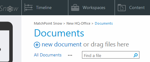
Breadcrumb
On every page above the page title the breadcrumb is displayed, which shows the current position of the user within in the Snow structure. The user can navigate to the different sections by clicking on the links.
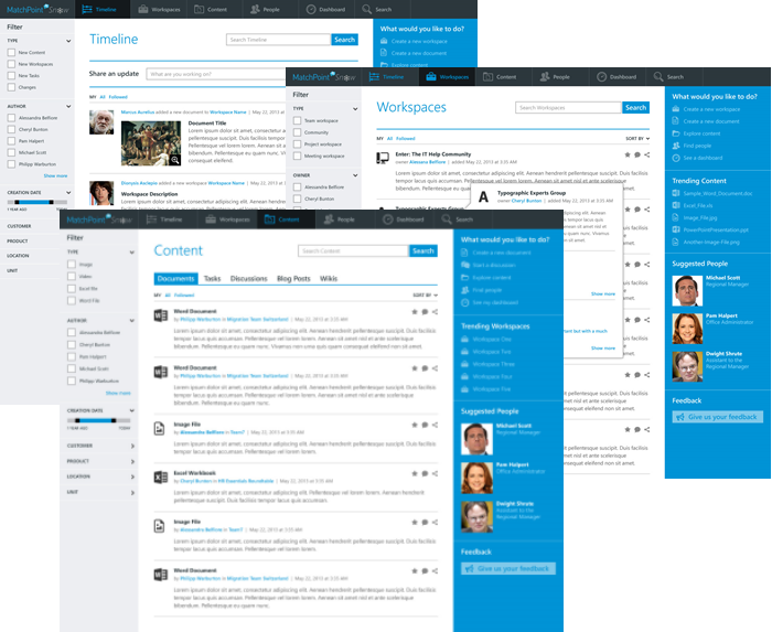
Overview Pages
Also known as "dimensions", these pages gather data from one or more sources and compile an aggregated list of items, relevant in the current context.
MatchPoint Snow provides the following overview pages:
- Timeline
- Workspaces
- Content
- People
- Reports
Each Snowflake can have its own overview pages.
Overview pages allow users to filter and interact with aggregated content. It is recommended to implement lazy loading for such pages, loading items only when they are needed (when the user scrolls to them).
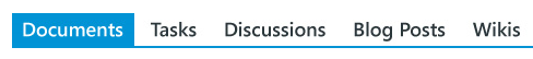
Grouping different content types
If you need to display several types of content on an overview page and you want to have them visually separated, then you can use the Tab controls.
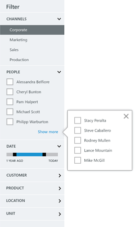
Filtering Entries
The number of items being displayed in an overview page can grow significantly with time. Therefore, users need to be able to filter out the content being displayed. There are two ways of doing this:
- By using the filtering bar, in the left column of the page
- By selecting different views.
have been introduced to allow administrators to create sets of predefined filters. Example of common filters are:
- "My" – shows all items created by the current user
- "All" – shows all items
Views are displayed centrally, above the aggregated items.
The filtering bar should always display values that apply to the content being displayed.
Consider, for instance, this scenario: the overview page displays a set of 100 items, each of them being tagged with one "Category" tag. The "Category" taxonomy contains in total 25 entries. The 100 items being displayed only refer to 5 of those categories. As a result, the filtering bar should only allow users to select one of those 5 categories referred by the current content, and not the entire list of 25 categories.
The filtering bar should only be displayed for pages aggregating information. It does not make sense to display the filter bar on a workspace home page, for instance.
Contextual Commands
Commands and actions that affect a single item in an overview page should always be displayed close to the item itself.
Examples of item-related actions:
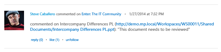
- Like (Unlike)
- Comment
- Reply
- View
- Share
- Delete
Glance-able information
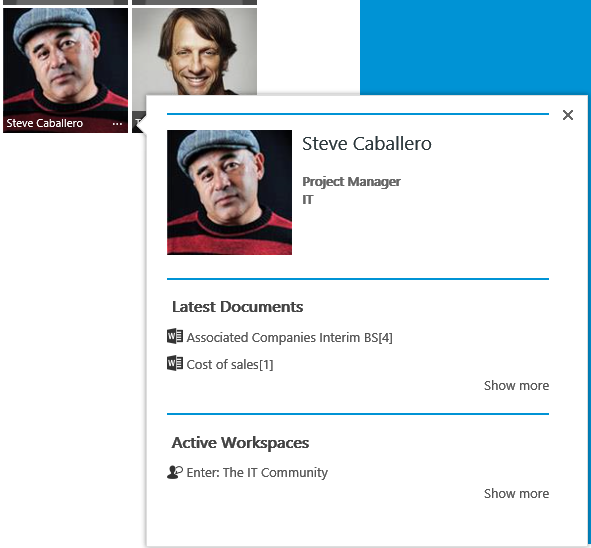
Sometimes, it is useful to show additional information about an item on an overview page without navigating to the actual item details. For this scenario you can use an Information Popup. The Information Popup is displayed when pressing the ellipsis (...) associated with the item.
Action Panel
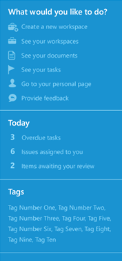
The Action Panel is displayed on most pages of MatchPoint Snow. It is normally used to display actions and glance-able information related to the current context, as well as widgets. The Action Panel should not contain items that refer to a particular item in a list of items.
For instance, the Action Panel could contain actions such as:
- Create a new document
- Create a new workspace
- Schedule a meeting
The Action Panel should not contain items such as:
- Edit item (when referring to a specific item)
- Share item
- Follow item
Snowflakes can add their own actions and components to the Action Panel. But the Action Panel should always have on top the "What would you like to do" section, which contains the actions relevant to the current context.
Dialogs and Wizards
Dialogs (modal popups) and Wizards are the main way of performing complex activities. Dialogs and Wizards should always be used when user input is required. A good rule of thumb to decide when to use a dialog versus a wizard is this: can you split the current activity into several steps? If so, then use a wizard. Otherwise, use a dialog.
Example of activity best suited for a dialog: the user needs to type in the title and the description for an item.
Example of activity best suited for a wizard: the user needs to select a location for a new document and then fill in the properties for the document.
As a general rule, the dialogs and wizards should always contain enough information to allow users to complete the action, without the need for training or for manuals.
Another useful rule is to design dialogs and wizards that allow users to complete an action by filling in only the most important information. For instance, when creating a workspace, the user should be asked to fill in the Title and Description of the workspace and to select the Workspace Type. Users should not be asked to choose the workspace logo, define permissions and roles or to change governance settings during the creation process. These actions can be done at a later time and are not mandatory.
User input validation should be performed in place, without the need for a postback.
Interaction Cheat Sheet
The following table contains the recommendations for interaction design for MatchPoint Snow.
| What you want to do | What you should do | What you should not do |
|---|---|---|
| Implement line of business logic or applications | Create a Snowflake | Change default behavior for OOTB components |
| Get user input | Use a Dialog or a Wizard | Use a Page |
| Validate user input | Do it inline, using JavaScript or Ajax calls | Do server-side validation, requiring a post-back |
| Get user input for a set of logically related fields related to a single item | Use a Dialog | Use a Wizard |
| Get user input for a complex operation, with multiple stages | Use a Wizard | Use a Dialog |
| Perform a time consuming, synchronous operation | Show a progress dialog | Block the UI or perform the operation in the background, without giving feedback about the progress |
| Add a contextual command for an item in an overview page | Add the command next to the item it refers to | Add the command in the Action Panel |
| Add a command that does not refer to a particular item | Add the command in the Action Panel | Add the command next to the navigation or filtering components or next to an item list. |
| Add a command that is only for administrators | Add the command to the Governance or Site Settings pages. | Add the command to the Action Panel |
| Add glance-able information such as weather info | Add it to the Action Panel | Add the information to the main content area |
| Add links to external applications | Add them to the Action Panel | Add them to the menu |
| Create a predefined set of filters for an overview page | Create a View | Modify the Filtering Panel |
| Visually separate items in an overview page based on their type | Use the Tab component | Create Views |
| Show glance-able information about an item in an overview page | Use an Information Popup | Navigate to the item details page. |