Design Principles
The guiding principles and design philosophy of the Microsoft Metro style forms the foundation which all designs are based upon. Adherence to these principles will ensure a consistent and pleasant experience for the end user.
The Microsoft Metro design philosophy can be summarized by the following points:
- pay attention to the details
- create a complete, thorough and polished experience
- fast and fluid, responsive and intuitive interactions
- create an authentically digital experience
- use balance, symmetry, and hierarchy
- use of vibrant colors and beautiful typography
- reduce the design to the essence giving more importance to the content.
Colors
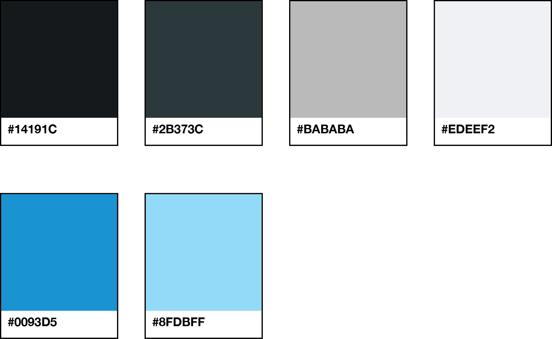
Color is generally used with restraint, and mainly shades of grey or blue can be found in the interface. This allows the content to come forward from the page, and also gives color more impact when it does appear.
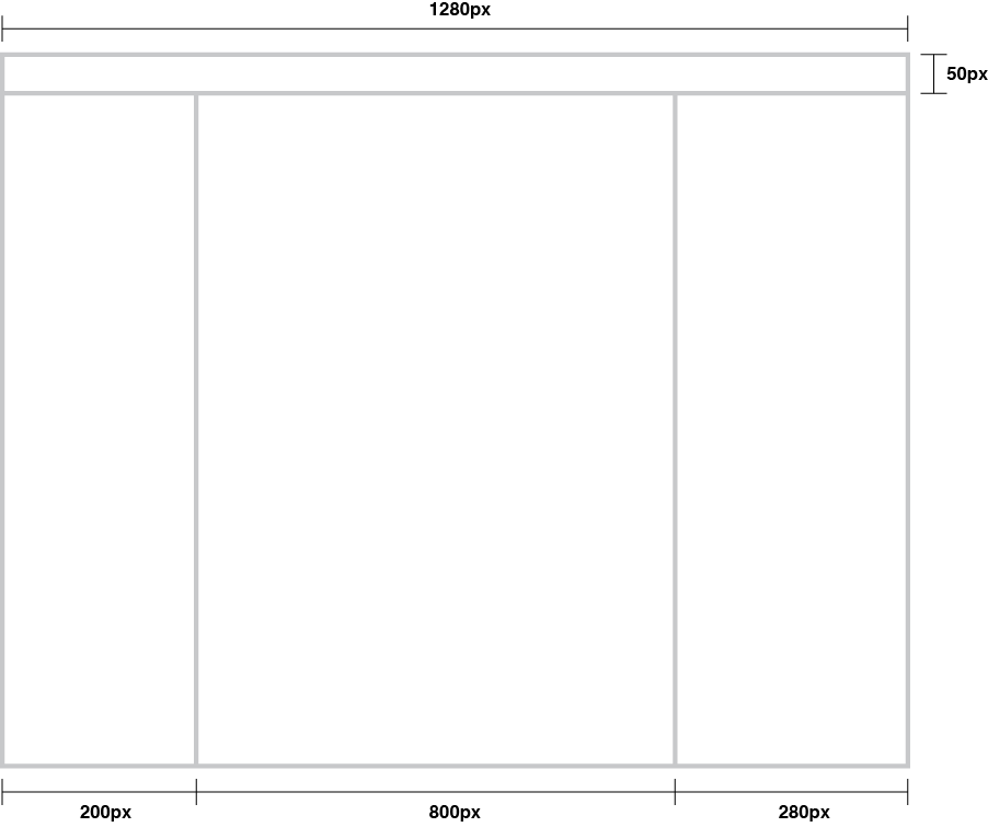
Layout Structure
The solution is divided into 4 main sections: a top bar containing the main navigation, the left column with filters for the main content, the central content area and a right column, or "action panel", which provides a selection of contextual actions.
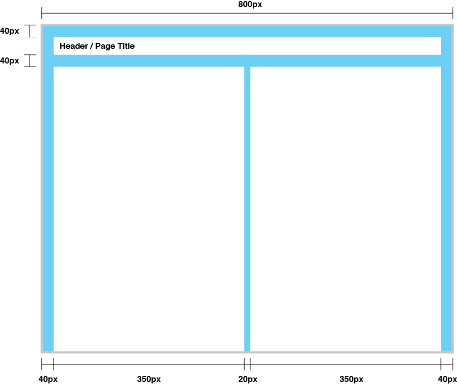
Content Structure
The main content area is 800 pixels wide and can display information at either full width, or be divided into two columns to suit the content being presented.
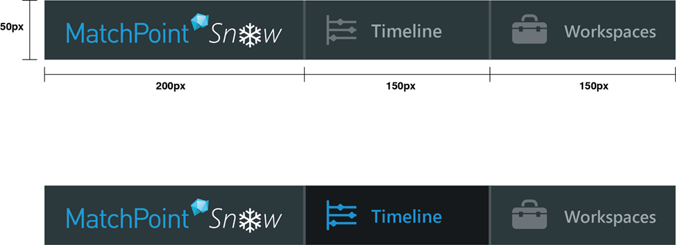
Main Navigation
The main navigation bar runs horizontally across the top of the page and is 50 pixels in height. Each of the menu tiles is 150 pixels wide. Mouse-over and active menu states are pictured below.
- Main menu inactive:
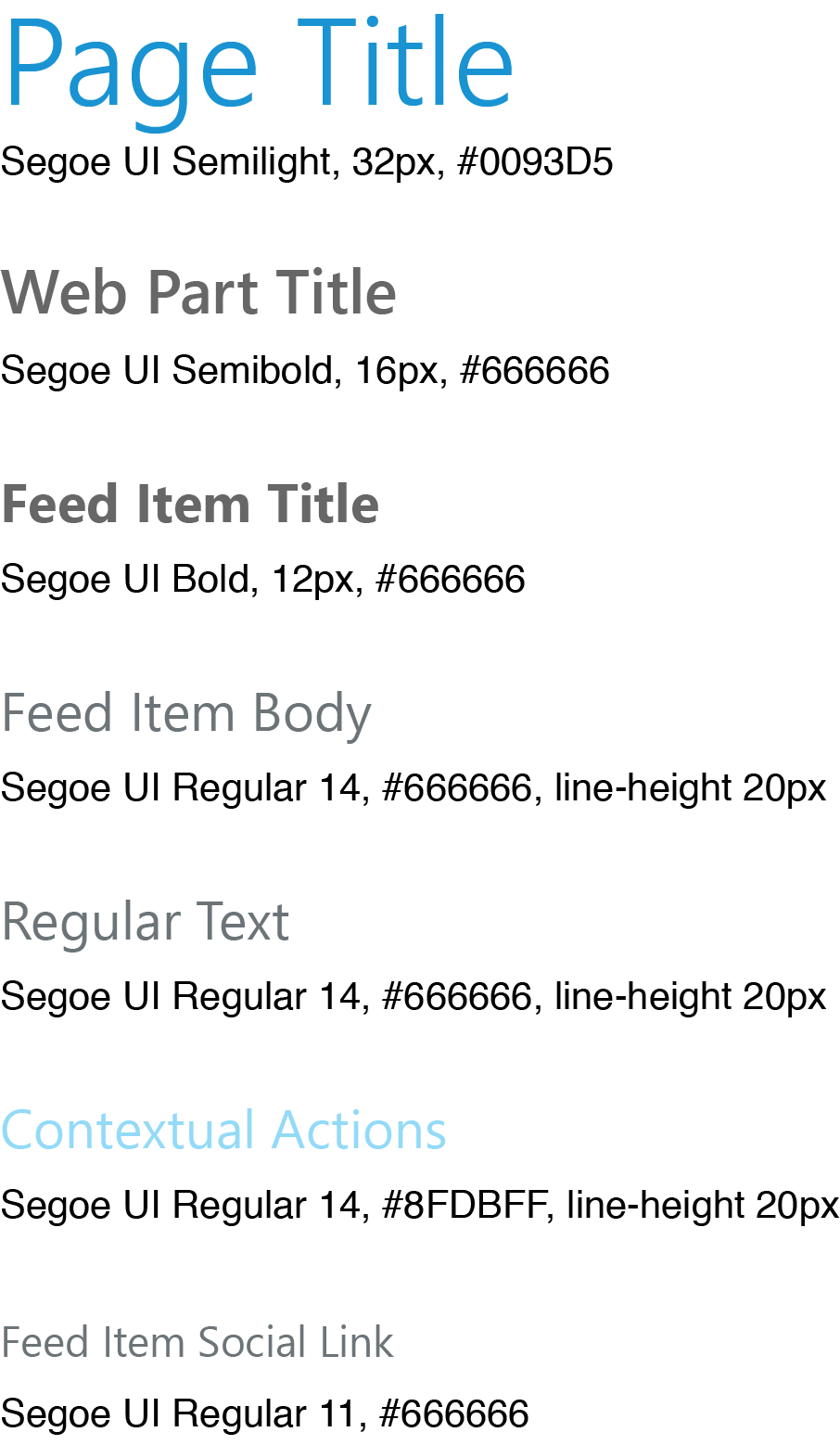
Segoe UI Semibold 14px,#9CA7AB - Main menu active:
Segoe UI Semibold 14px,#0093D5 - Sub menu inactive:
Segoe UI Regular 14px,#9CA7AB - Sub menu active:
Segoe UI Regular 14px,#0093D5
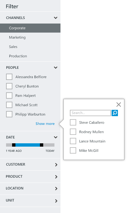
Filtering
The left column contains a variety of filters that can be used to refine the information displayed in the central content area. These filters are organized into collapsible panels and may contain either vertical type menus, lists of check boxes or slider menus. Lists that are too long to display easily may be truncated and open in a fly out, including a search box.
Below pixel values are approximate suggestions, as the actual values are dependent of the font-size, padding, etc. The 200px of the width however are fixed.
- Filter title:
Segoe UI Semibold 18px,#2B373C - Panel heading:
Segoe UI Semibold 12px,#2B373C - Panel list item:
Segoe UI Regular 12px,#2B373C
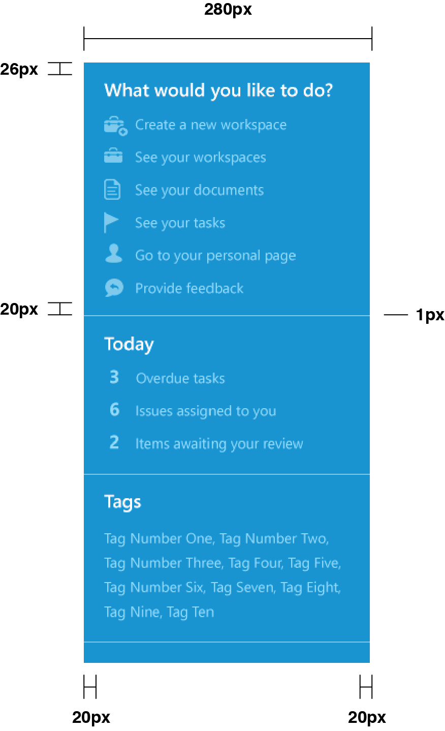
Action Panel
The right column contains a variety of contextual actions that are related to the main content. The action panel utilizes a blue background to distinguish it from the other types of navigation. The contents of the column are separated by a single pixel line.
- Panel heading:
Segoe UI Semibold 18px,#FFFFFF - Panel list item:
Segoe UI Regular 14px,#8FDBFF
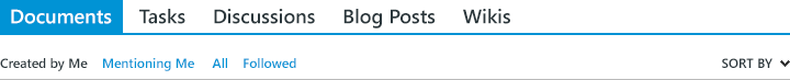
Tabs
Tabs may be used to alternate between views of information within the same context. The information in an active tab can be filtered by the criteria shown in the horizontal bar pictured below the row of tabs.
- Active tab:
Segoe UI Semibold 18px,#FFFFFF - Inactive tab:
Segoe UI Regular 18px,#2B373C - Active sort:
Segoe UI Semibold 12px,#2B373C - Inactive sort:
Segoe UI Regular 12px,#0093D5
Typography
The Microsoft font, Segoe UI was chosen for its legibility and friendliness. It is the default font used in Windows and a component of the Metro design style.
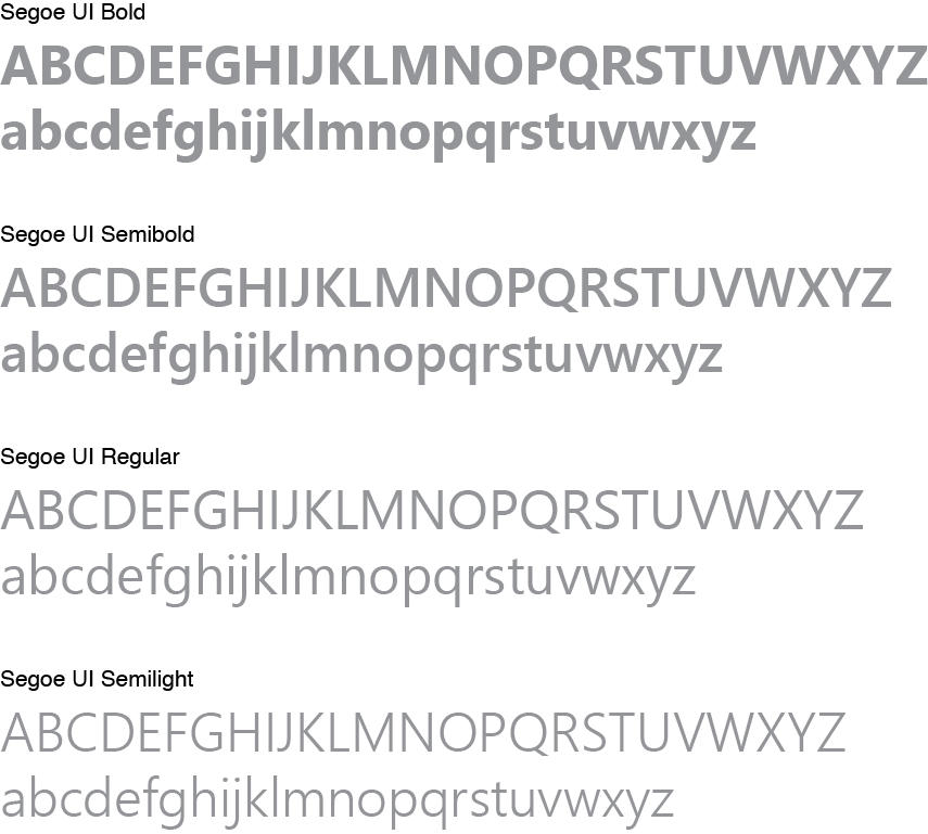
Usage
When composing with text it is important to use the correct font size and weight, as this is critical to establishing a clear visual hierarchy. The graphic below illustrates the specifications of the font Segoe UI to be used, and the hierarchical order in which information should be presented.
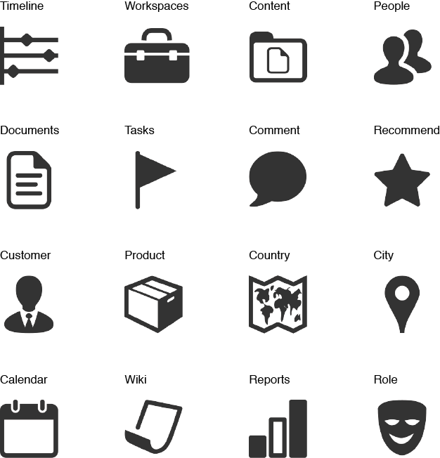
Iconography
Most of the icons used are from an extensive set of 1,600+ created by VisualPharm (www.icons8.com, icon pack for windows 8) Others have been customized or modified to suit specific needs. These icons have been created in the Microsoft Metro style, with clean, simplified shapes and flat design to enhance readability.
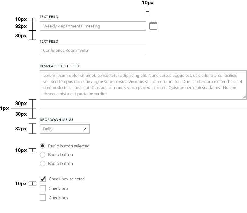
Forms & Form Elements
Forms may appear in either the content area or in a modal pop-up window. For longer forms, the form elements may be organized into logical groups and separated by a single pixel line. Groups of form elements are separated by a 30px vertical space.
- Field labels:
Segoe UI Regular 12px,\#2B373C - Hint text:
Segoe UI Regular 14px, #999999` - Radio button labels:
Segoe UI Regular 14px,\#666666 - Check box labels:
Segoe UI Regular 14px,\#666666
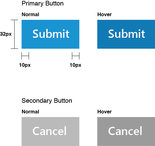
Button Styles
A blue button style is used to fit in with the colors used all over MatchPoint Snow.
- Normal background:
#0093D5 - Hover background:
#007AB3 - Normal font:
Segoe UI Semibold 18px,#FFFFFF - Font-Size:
Segoe UI,14px - Button Height:
35px